


Stefan Vanthuyne
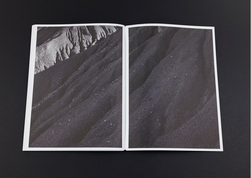
Spread from LAND – On the brink of some formidably complex matter by Laura Van Severen / © The Eriskay Connection
2016 was a good year for Rob Van Hoesel, the Dutch designer running The Eriskay Connection, with three books from the TEC-catalogue selected for the Best Verzorgde Boeken 2016 – the best designed books of 2016. Two of them are projects by Belgian photographers: LAND. On the Brink of Some Formidably Complex Matter by Laura Van Severen and (un)expected by Peter Dekens. Dekens’s book also won the Silver Medal at Die Schönsten Bücher aus aller Welt.
You are a designer turned publisher. So you can work on a project from book concept until effective publication?
Rob Van Hoesel: “Actually, yes. I graduated in 2002 at the AKV St. Joost in Breda as a graphic designer. After that I started working at Kummer & Herrman, an agency that made a lot of books and did a lot of cultural projects. Then I became a dad and I got sick of commuting from Utrecht to Breda, so it seemed like a good time to start working for myself. I made posters, worked on campaigns and did the scenography for exhibitions. And I made books. Books are lasting objects. They have value. So I wanted to make more of them. I noticed, however, that the book projects I worked on for artists and photographers ended up remaining on the publishers’s shelves, or they eventually got self-published. Either way, those projects never really took off. I regularly sent books to publishers I wanted to work for, but then the reply I got would be that they always worked with the same designer. This continued for a while, until I saw some inspiring examples of designers who had started their own imprint – Hans Gremmen with Fw:Books, Roger Willems with Roma Publications – so I decided to give it a go myself.”
The last couple of years you’ve worked with three Belgian photographers. Laura Van Severen, Karin Borghouts and Peter Dekens, who studied photography in Holland. What attracted you to their work?
Van Hoesel: “Peter graduated at St. Joost, just like me. That’s how we got in touch. Touch was his graduation project. What I find special about Peter is the way he manages to gain the trust of the people he portrays. The subjects he deals with are quite intense, but he goes about it in a very delicate manner. He has a very modest posture, but at the same time he has the guts to approach someone. I think we understand each other well.”
Peter uses a documentary approach, where the work of Karin Borghouts has a more formal aspect to it.
Van Hoesel: “Peter introduced me to Karin. Her work usually is indeed more formal, but the project I did with her (The house, interior photographs of her parental house that burned down, ed.) is much more personal. That is probably the reason why she came to me. Karin has a completely different personality. Thoughtful – at least that’s how I experienced the images.
In fact her series was so strong that I really didn’t have to do much with it as a designer. Working on it went automatically. In the end it became a modest, loose-leaf publication.
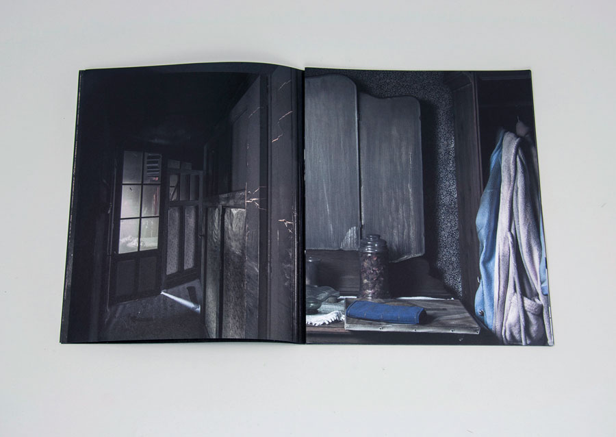
Spread from The House by Karin Borghouts / © The Eriskay Connection
I saw LAND by Laura Van Severen in several different dummy stages. Design seemed to be a difficult factor here.
Van Hoesel: “I met Laura at Unseen in Amsterdam. She had shown me her dummy after Andrea Copetti from the Tipi Bookshop had referred her to me. I thought it was very good and fascinating. She had made very beautiful photographs, but in the dummy she let them run over the fold of the pages – it was a book with a Japanese fold. Though I found that deconstructive approach appealing, I also felt like she took it a bit too far, ruining a lot of great images. So we got to talking and we started a new design together, looking for a better balance.”
“As a designer it doesn’t happen all too often that you make something that genuinely moves the author. That’s very special. That’s when you know you’ve got it right” (Rob Van Hoesel)
In (un)expected, Peter Dekens’ second book, five stories in colour about those who remain after a suicide, are being placed within a geographical context in black and white. This not only works well, it also gives the book a certain serenity. As a designer, how do you deal with the gravity of the subject?
Van Hoesel: “I think it’s important for a designer to be open to the sensitivity of a subject. For Peter this was a very personal story – his mother is one of the people who took her own life and his father is the subject of one of those stories in the book. You know this is going to be a delicate book. A book that has a lot of personal meaning to Peter. What is so nice about Peter – and it already was when we worked on Touch – is that he had already made some dummies and carried some books as examples with him. For (un)expected he had made a hexad that actually worked quite well. If you closed it, you saw the images of West-Flanders and if you opened it up, you discovered those little stories. I really liked that. The only issue I had with it, is that because of the way it was folded, you could only use six photographs to tell the story. So I wanted to look for another way to have these stories sort of drown in the black and white images of dreary West-Flanders. Because that clearly had to be the scenery where these stories occurred. Those pages had to present the bigger picture within which he portrayed those vulnerable people.
Eventually it all went rather smoothly. First I had made a dummy of two chapters – amongst them the one of his father. When I showed it to him, he became quite emotional. As a designer it doesn’t happen all too often that you make something that genuinely moves the author. That’s very special. That’s when you know you’ve got it right.
Between Touch and (un)expected Peter and I worked on another book on terminally ill patients in a care centre. We never got to printing it, because we couldn’t quite figure it out. We did print it digitally in a small edition; in that sense it was completed. But in one way or another we simply didn’t manage to find a form that worked well. While with Touch and (un)expected we had succeeded so well. It is still a rare occasion when form and content interlock in such a way that it really adds up. When that happens it’s a real gift, even for the designer.”
Content for this platform is written by non-native English speakers. If you find some flagrant mistakes, please don’t hesitate to let us know.
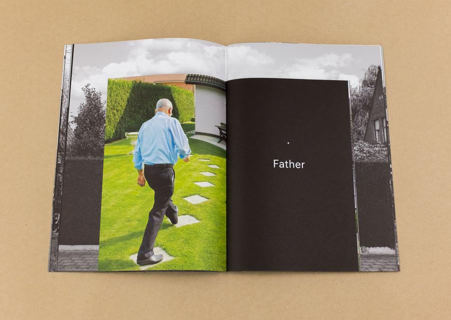
Spread from (un)expected by Peter Dekens / © The Eriskay Connection